In the realm of video production, few things are as critical or as nuanced as the art of cinematic colour grading. A skill that, when mastered, can transform the look from mundane into mesmerising, taking your storytelling to new and evocative heights. This guide will help you master the art of cinematic colour grading, illuminating your path forward with expert advice, step-by-step guidance, and insider tips and tricks.
Introduction to Cinematic Colour Grading
It is more than just a post-production process; it’s a form of visual storytelling that can breathe life into your footage, evoke emotions, and amplify your narrative. It’s the fine-tuning of colours, the balance of shadows and highlights, and the enhancement of visual aesthetics that can make a video feel truly cinematic.
But what exactly is it, and why is it so essential in video production? How can the right colours influence viewer engagement and shape audience perception? And more importantly, how can you master this intricate art? Let’s dive deeper into these questions.
What is Cinematic Colour Grading?
Cinematic colour grading is the creative process of altering and enhancing the colours in a video to achieve a specific look or mood. Often, this involves adjusting the brightness, contrast, colour balance, and saturation to create a visually appealing and consistent aesthetic that complements the narrative. While colour grading may seem like a technical endeavour, it is, in essence, an artistic pursuit. It’s about understanding the emotional resonance of colours, how they interact with each other, and how they can be manipulated to set the tone, mood, and atmosphere of a scene. In essence, it’s about using colours as a storytelling tool.
The Importance of Cinematic Colour Grading in Video Production
In the world of video production, cinematic color grading is not just a luxury—it’s a necessity. It’s the secret sauce that gives your video that ‘filmic look’, setting it apart from amateur productions and elevating it to a professional standard. However, the importance of cinematic colour grading goes beyond aesthetics.
Colour Psychology in Video Production

Colour psychology plays an integral role in video production. Different colours evoke different emotions and reactions in viewers, subtly influencing how they perceive and respond to the narrative. For instance, warm colours like red or orange can express passion, intensity, or warmth, while cool colours like blue or green can evoke feelings of calm, tranquillity, or melancholy. By understanding the psychological effects of colours and using cinematic color grading to manipulate these effects, filmmakers can create a deeper emotional connection with their audience, enhancing the storytelling experience.
The Impact on Viewer Engagement
It can also significantly impact viewer engagement. A well-graded video is visually appealing, captivating the audience’s attention and drawing them into the narrative. On the other hand, poorly graded footage can be jarring and distracting, disrupting the viewing experience and potentially alienating the audience. Moreover, consistent colour grading across such as cool shadows and warm highlights on a video or series of videos can create a unique visual identity, making your content instantly recognisable and memorable to viewers. This can strengthen your brand identity and foster viewer loyalty.
The Basics of Cinematic Color Grading
Before we delve into the tools and techniques of cinematic colour grading, it’s essential to understand some basic concepts. These concepts lay the foundation for the grading process, providing you with a solid grounding from which to explore more advanced techniques.
Primary among these concepts are the three elements of colour: hue, saturation, and luminance.
- Hue refers to the colour itself.
- The term “saturation” is used to describe the purity and intensity of a color.
- Luminance is the brightness or darkness of the colour.
Understanding these elements and how they interact is crucial for effective colour grading. For instance, adjusting the saturation can dramatically alter the mood of a scene, while tweaking the luminance can affect the perceived depth and dimension of the image.
Tools and Techniques to Apply Cinematic Color Grading
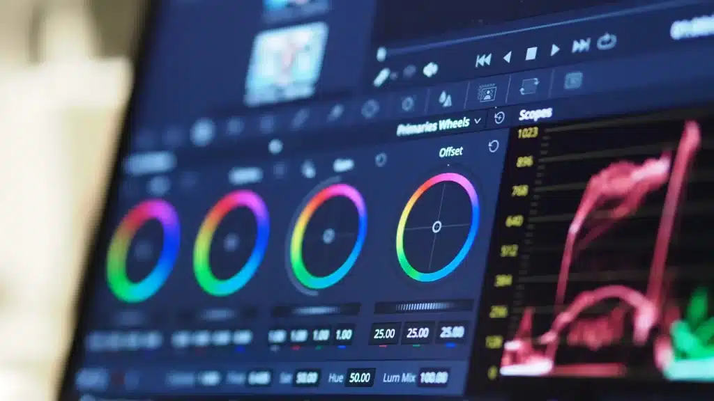
There are numerous tools and techniques available for, each offering different capabilities and levels of control. Some popular tools include DaVinci Resolve, Adobe Premiere Pro, and Final Cut Pro, all of which provide a variety of colour-grading features and functions.
- One common technique is the use of LUTs (Look-Up Tables), which are preset colour grades that can be applied to specific footage to achieve a desired look. LUTs can be a great starting point for grading, especially for beginners, but they should be used judiciously and customised to suit the particular needs of your footage.
- Another essential technique is colour balancing, which involves adjusting the red, green, and blue colour channels to achieve natural-looking colours, and colour correction, which is the process of fixing any colour issues or inconsistencies in the footage.
How to Master Cinematic Colour Grading – Step-by-Step Guide

Mastering this is not something that happens overnight. But with the right approach and a solid understanding of the fundamentals, you can develop the skills and proficiency necessary to grade your footage like a pro.
- Start by familiarising yourself with your grading software. Get familiar with the interface, tools, functions, and workflow.
- Next, practise working with the essential elements of colour. Experiment with adjusting the hue, saturation, and luminance, and observe how these changes affect the image.
- Once you’re comfortable with the basics, start exploring more advanced techniques like colour balancing, colour correction, and LUT application. Again, practice is key—try different techniques and settings, learn from your mistakes, and gradually refine your skills.
- Finally, develop your artistic eye. Learn to understand the emotional language of colours, study the colour grading in films and videos you admire, and cultivate an aesthetic sense that guides your grading decisions.
- Remember, mastering this is a journey, not a destination. Always strive to learn, grow, and improve, and don’t hesitate to experiment and push your creative boundaries.
FAQ

What is the Best Color Grade for Cinematic Video?
There isn’t a one-size-fits-all answer to this question, as the ‘best’ colour grade entirely depends on the story you’re trying to tell. However, certain colour grading styles are commonly associated with the ‘cinematic’ look. One popular style is the ‘orange and teal’ look. This involves grading the skin tones to a warm orange and the shadows to a cool teal, creating a pleasing colour contrast. Another popular style is the ‘vintage’ look, often used in period dramas or films set in the past. This involves desaturating the colours, adding a slight yellow tint, and often adding film grain for a textured, ‘aged’ look.
What is Color Grade with Cinema Grade?
Cinema Grade is a modern colour grading software that bridges the gap between the traditional layer-based grading tools and the grading panels used in high-end grading suites. It’s a plugin that works within your editing software, allowing you to grade your footage directly on the image. Cinema Grade offers on-screen colour grading, real-time previews of LUTs, and even an auto-match feature, which can match the colour of your footage to the colour of a reference still.
What is Videographer Color Grading?
Videographer colour grading refers to the colour grading process in the context of videography. Videography is a more broad term that encompasses anything from corporate videos to wedding films, music videos, and more. The principles of colour grading remain the same, but the application may differ slightly depending on the context. For instance, a wedding film may require a more romantic, soft colour grade, while a corporate video may require a clean, neutral grade that accurately represents the brand’s colours.
What are Cinematic Colors?
Cinematic colours refer to the specific colour palettes often used in cinema. These can vary drastically depending on the genre, the director’s style, or the story’s mood. However, some specific colour palettes have become synonymous with the ‘cinematic’ look.
As mentioned earlier, the ‘orange and teal’ look is one of the most popular cinematic colour palettes, often used in action films or big-budget blockbusters. This palette creates a strong colour contrast, making the subjects stand out against the background. Another common cinematic colour palette is the ‘blue and amber’ look, often used in drama or thriller films. This palette creates a moody, atmospheric look that can heighten tension or evoke feelings of melancholy.
Conclusion: Cinematic Colour Grading
Cinematic colour grading is an art—one that requires both technical proficiency and creative intuition. But with practice, patience, and a passion for storytelling, you can master this art and use it to create truly compelling and visually stunning videos. So, take the first step on your cinematic colour-grading journey today. Embrace the challenge, savour the process, and let your creativity shine. And remember, every great filmmaker was once a beginner, just like you.


